Retention is the Key to both Traction and Growth
If you've been paying attention to much of the great content out there on growth, you've probably been noticing that retention is the MOST important aspect of both early traction and long term growth.
Retention in a Nutshell
For your business to grow you need to have more customers (or users depending on your business model). Now you already know that, it's kind of stating the obvious, but its so easy to fall into the trap of focusing on acquiring new users while forgetting to make sure you are keeping a share of those new users. And thats where Retention comes in.
Retention then is about [making sure you keep customers each month](GHOST_URL/5-customer-retention-strategies-to-increase-growth-now/" target="_blank), so at the end of each month you have new customers you have retained PLUS the customers acquired (and retained) in previous months. Even better, over time this builds because retention is a multiplier and compounds over time as users stay longer, drive more revenue, push up LTV, open new acquisition channels and refer more users who accelerate this growth.
The name of the game then, with both Growth and Traction is keeping customers. The longer you keep customers, the faster you business will grow.

“As we retain a user for longer and longer, we get more opportunities for them to bring other users.”
(Brian Balfour, VP Growth, Hubspot)
Understanding Retention via Cohorts
A Cohort is a group of people who have something common. If you graduated from Stanford university in 2005 you would be part of the 2005 Stanford Graduates cohort. The Millennium Generation is a cohort. Baby boomers are a cohort.
When it comes to your business, cohorts are most useful when we apply them to a start date and this is typically the Signup Week or Signup Month (January Signups, February Signups, March signups, etc..).
Our goal with Cohorts is to compare behaviour on each successive month, and achieve an improvement with each successive month. So, if we're measuring how frequently users come back, we'd want to see that our March users come back more than our February users, and that our February users come back more than our January users.
I want to keep this article light, but you should definitely read [how to measure if users love your product using cohorts ](http://andrewchen.co/how-to-measure-if-users-love-your-product-using-cohorts-and-revisit-rates/" target="_blank) by Andrew Chen.
Retention Curves show the Trends
Cohort Reports are often provided in table form - but they aren't so easy to read in table format. So if we can get that data into a nice graph where we can "see" the data and the trends, its so much easier to see how our retention is (hopefully) improving.
A retention curve like that shown below, helps you see how long users are retaining. And comparing these curves over time lets you see how retention is improving.

(Image credit: mashauri.com)
So, how to create these curves?
How to Create Retention Curves from Mixpanel Cohorts using Google Sheets
Ok, now you know WHY retention curves matter, I'm going to show you how to turn your Retention (Cohorts) Reports in Mixpanel into beautiful Retention Curves using nothing more complicated than Google Sheets. This article was inspired by [a post by Dan Croak](https://robots.thoughtbot.com/create-a-retention-curve-with-mixpanel-and-google-sheets" target="_blank) with one KEY difference - that here we create the retention curves using percentages, which makes cohorts instantly comparable, regardless of the actual number of users in any cohort. It takes about 5 minutes.. Ready? Lets's go!
Export from Mixpanel - in 3 mins
PART 1 - Grab the Data from Mixpanel:
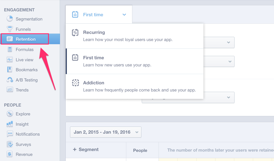
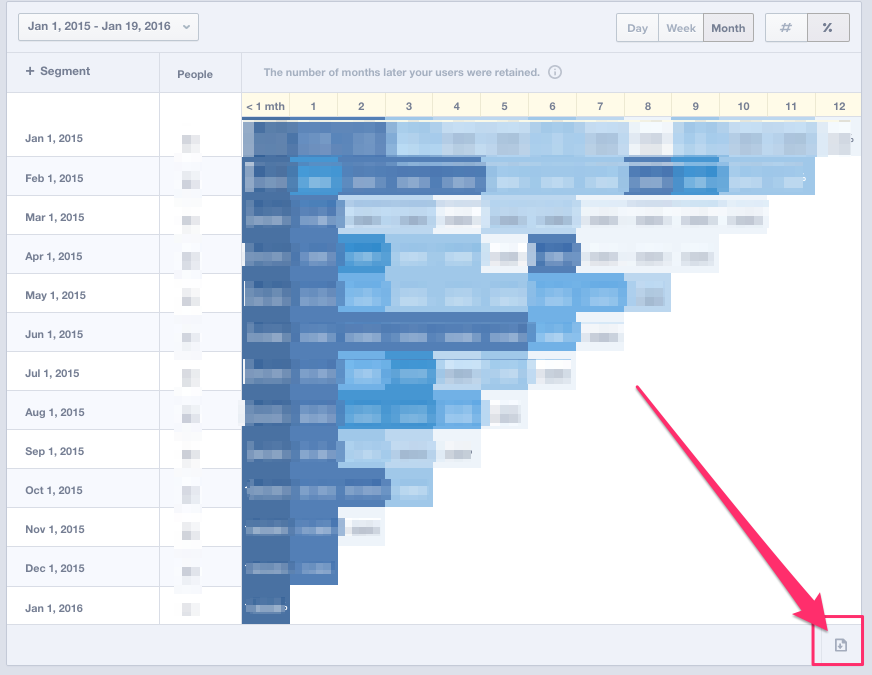
STEP 1. Login to Mixpanel and Select Retention
SIDE NOTE: If you aren't yet collecting this data in Mixpanel, then I recommmend you start collecting today. Its easy to get started and you can use a service to [easily capture and send data to mixpanel](https://www.popcornmetrics.com/mixpanel" target="_blank) so you can get setup without needing to go talk to your developers. As a minimum you should track user signups, and key actions they take on your website/webapp.
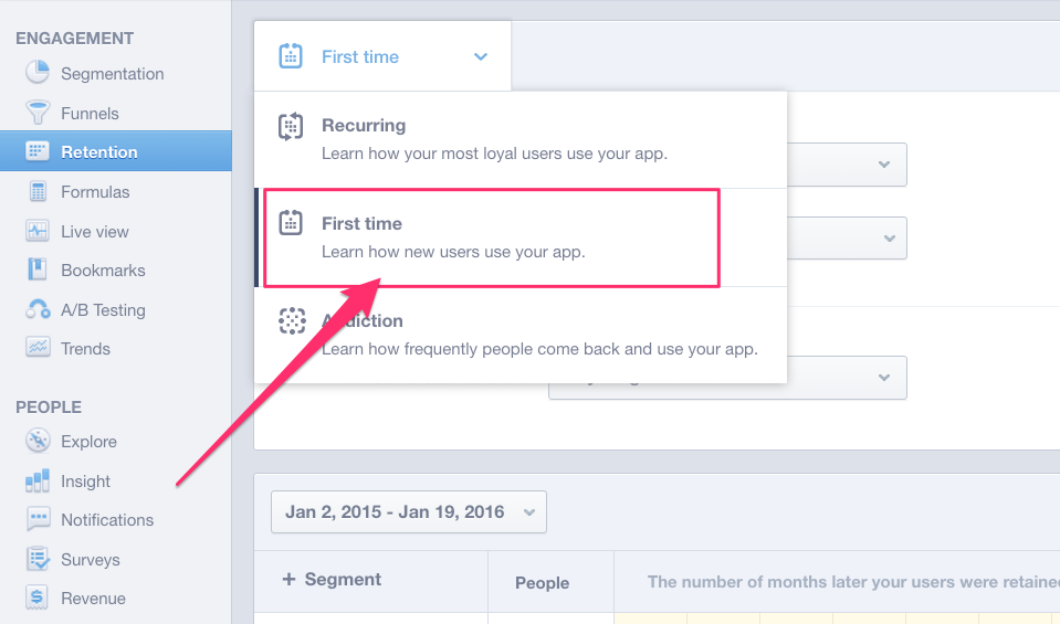
STEP 2. Select "First Time" - this will allow us to create cohorts by Signup date.
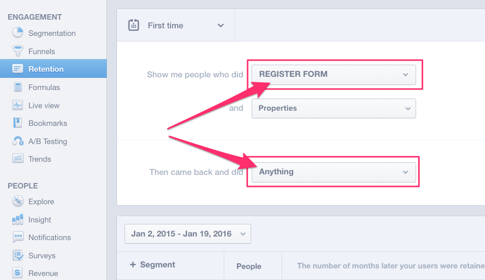
STEP 3. Select people who did Signup (in this case I'm selecting our REGISTER FORM event, it depends what you've called the signup event in yorr Mixpanel) -
Then select did “Anything”.
NOTE: Later, instead of "Anything" you could select by a key action so you could build retention curves by key actions to find the actions that best retain users. For simplicity though, we'll start with people who came back and did "Anything".
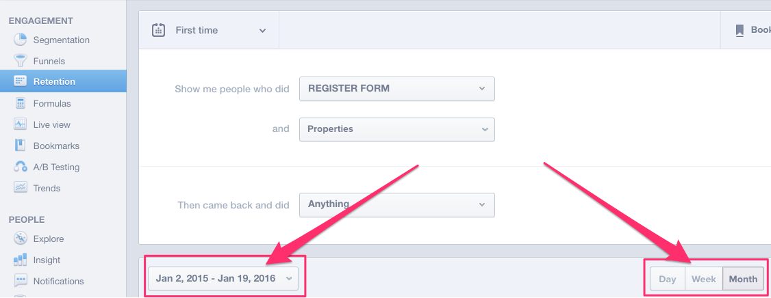
STEP 4. Optionally Select: Past 12 Months, Past 12 Weeks, Past 14 Days. For this example, I'm going to select Past 12 Weeks.
STEP 5. Select Export CSV: In the bottom right corner there is a small icon that will let you export the data as a CSV file. Go ahead and download the data.
(NOTE: Mixpanel only exports the totals not percents, but we'll solve that in a moment.)
PART 2 - Upload to Google Sheets and Create the Retention Curve:
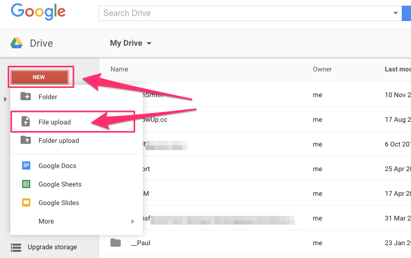
STEP 6. Open Google Drive and Upload the file. Then open the file.
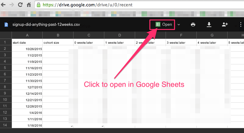
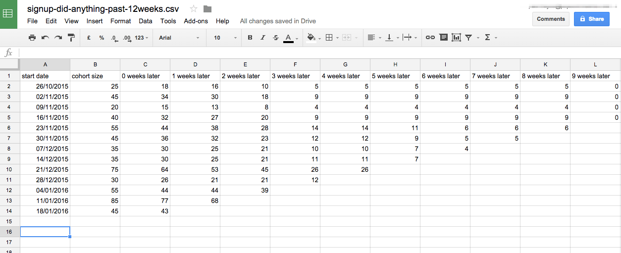
STEP 7. Open the file in sheets - you'll see the same data as in Mixpanel. Remember these are totals, and that’s okay, but cohort sizes can vary, so to be comparable I prefer to look at percentages. (because what we're interested in is comparing behaviour of the cohorts - regardless of the cohorts size.)
STEP 8. We're going to take an extra step here and turn the totals into percentages, so our curves are more comparable.
STEP 9. Select, copy and paste ALL the data below, so you have two copies.
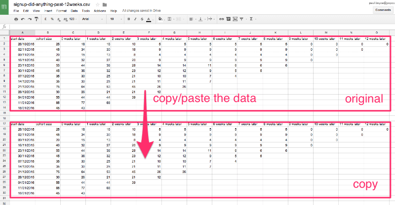
STEP 10. In the copy section, edit the first cell (shown) to calc using the data above.
The cell formula will be this:
=if($B2, C2/$B2*100, 0)
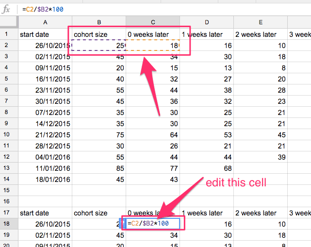
STEP 11. Format the cell (pick any colour you like, its only so you can see what we're changing)
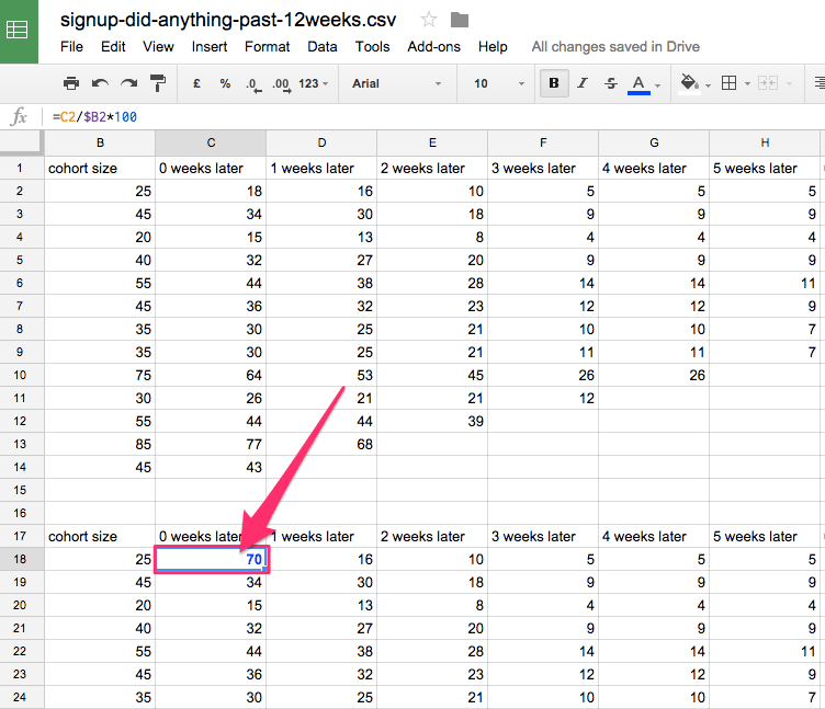
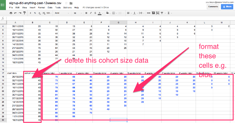
STEP 12. Copy and paste that cell into the other cells in the copy area. Also, delete the Cohort Size data from the copy area, because we don't want to show it in the chart.
STEP 13. Select all the data we've modified, and select Menu Insert > Chart.
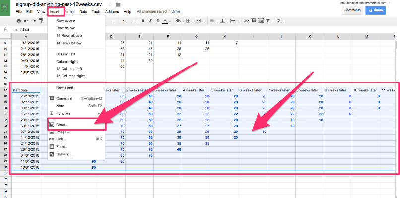
STEP 14. Set the following settings:
Chart Types: Line (Curve)
Switch rows/columns = True
Use column A as headers = True
STEP 15. Using one colour for all lines can help make the data standout better. Try to use one column in the colour picker, and make more recent months be a darker shade.
(If you run out of colours you can switch to thicker lines, or use colours in pairs.)
BOOM! You’re done! Easy huh? You should now have a retention curve that looks something like the curve below.
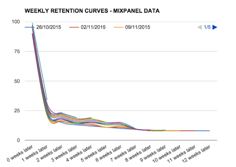
For this particular set of data, you can see the typical shape of a retention curve, with a fairly fast drop off during the first week (which is when people's attention is generally higher) and over time the curve levels out (showing around 13% longterm retention). Also note that some of the most recent curves are higher (showing better retention) which is what you would expect as a company works to improve retention.
Of course measuring user retention is only a part of your growth strategy and needs a good marketing analytics tool stack. If you want to set up an essential stack with key tools covering acquisition channels, conversion funnels & retention, and automated customer messaging read our [7 Essentials of Marketing Analytics - a Beginners Guide](GHOST_URL/6-essentials-of-marketing-analytics-a-beginners-guide-for-startup-growth-hackers/" target="_blank).
I hope you enjoyed this article, and if you think I've missed something, or maybe you have a question about user retention - please just add a comment below.
p.s. If you learned something we would greatly appreciate shares and retweets. Interested in detailed posts about metrics, experiments, user engagement and retention? I write a few thoughtful articles per month, if you don't want to miss out, [subscribe here to get the next article](http://eepurl.com/baYjsv " target="_blank).